
Poonawalla
fincorp
Timeline
Feb - March
(1 Month)
My Team
UI UX team
Project manager
Content team
Tools used
Figma
Illustrator
Blender


Client
Poonawalla Fincorp
Service
Product Design
Overview
Introducing a super app designed to revolutionize the delivery of financial services.
This seamless, one-stop solution caters to both consumers and MSME enterprises, offering a wide range of financial products. Users can effortlessly apply for Instant Loans, Personal Loans, Business Loans, Professional Loans, Medical Equipment Loans, Loans Against Property, and Pre-owned Car Loans through this app.


Discovery
Stakeholder workshops, app and market analysis, technical requirements.

Evaluating
Analyzing data, defining problem statements

Ideating
Creating design concepts, making wireframes, conducting stakeholder reviews.

Design
Creating HiFi wireframes, developing design system, finalizing design.

What We Learned Early On
From our stakeholder workshops, we knew this app needed a glow-up. Here's what we locked in:
Make it feel fresh, modern, and user-first
Compatible across Android & iOS
Focus Phase 1 on 12 core modules (onboarding, home, support, etc.)
Keep user journeys short, simple, and smart
Let users customize their experience
The Problem
The app was cluttered, boring, and overwhelming.
Users got stuck, lost interest, and dropped off.


What We Did About It
From our stakeholder workshops, we knew this app needed a glow-up. Here's what we locked in:
Old-school visuals?

Clean UI, modern colors & crisp typography
Too many form fields?
Collapsed into smart, accordion-style inputs
No personal touch?
Let users tweak themes, profile, layout
Boring screens?
Added GIFs, micro-interactions & subtle animations
Confusing benefits?
Used icons + plain language to explain clearly
Rewards flow was messy?
Redesigned it for clarity and fun

Poonawalla fincorp

Bajaj finserv

IIFL
Finance
Minimalistic Ul
Short Loan Application Process
Interactive design
Feature-rich Ul
Streamlined Loan Application Process
Minimal forms
Detailed Feedback and Guidance


Competitive analysis
User persona

Rohan
Data analyst

Gender
Male

Age
30

Location
Urban
Background
Rohan, 30, is a data analyst in an urban area. He saves for a house and occasionally applies for personal loans but finds the process confusing. He values data privacy, clear loan terms, quick and intuitive app designs.
Primary goals
Saving for a house
Securing Low-Interest Loans
Simplifying the Application Process
Customer Support
Needs and preferences
Clean and Intuitive Design: A clutter-free interface that is easy to navigate
Transparent Information: Accessible and understandable loan terms and conditions.
User-Friendly Forms: Simplified and pre-filled forms to reduce the time and effort required for data entry.
Pain points
Confusing Loan Application Process: Finds the current loan application process overly complicated and difficult to navigate.
Lengthy Approval Times: Experiences frustration with long waiting periods for loan approvals and fund disbursement.
Poor Mobile Experience: Finds financial apps difficult to use on mobile, leading to frustration.
Cluttered Interface: Dislikes apps with a cluttered design, making it hard to find necessary information and tools.
Preferred features
Quick Loan Applications
Quick Access to Support
Clear Loan Terms
Clean, Intuitive Design
Wireframes


Revamping the onboarding process.
Users found onboarding difficult, so we reduced the steps and improved the design. This made onboarding quicker and easier, enhancing the overall user experience.
The initial onboarding featured non-interactive and static UI and lengthy forms, which increased the cognitive load on the user



Before
After
Replaced static images with engaging GIFs to make the onboarding experience more dynamic and visually appealing
Redesigned the tedious onboarding process into a simplified journey with minimal steps, ensuring a quick and easy start for new users
Onboarding
Revamping the home screen with a fresh, engaging design
Users found onboarding difficult, so we reduced the steps and improved the design. This made onboarding quicker and easier, enhancing the overall user experience.
Home screen
Updated the banners in a carousal format for a more dynamic and engaging user experience


Before
After
updated the bottom navigation to enhance user navigation and improve accessibility, making it easier for users to manage their profile, explore various service categories, and access support."
Introduced a coin system to engage users, providing incentives and rewards to encourage regular use and interaction with the app
“My Favorites” section for managing preferred services, enhancing user convenience and personalization
All products are now curated into a single section on the first scroll, providing easy exposure to the available services
Loan details
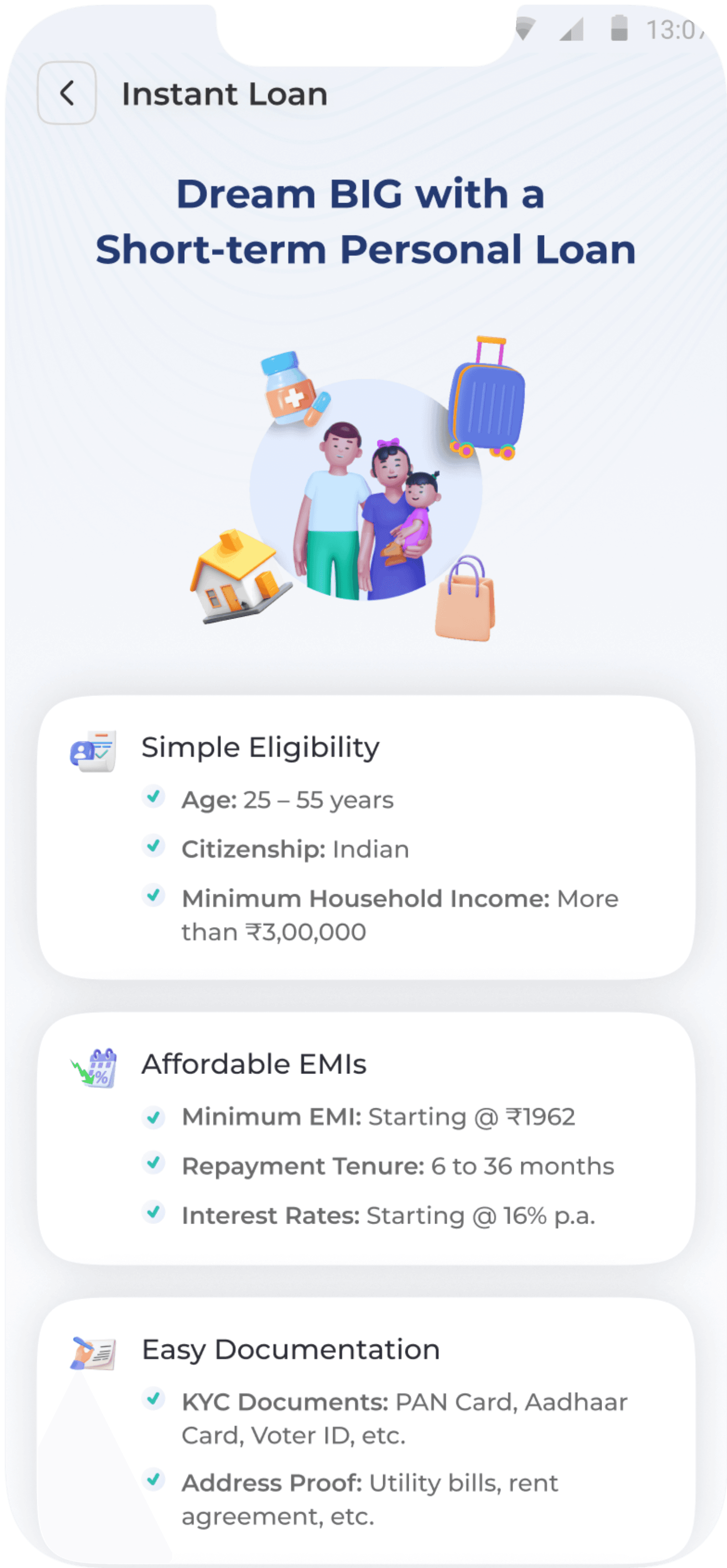
Transforming loan details section
making it more clear and easy to scan the information without getting bored. sound it like sub heading
Presented loan criteria in large, complicated blocks, making it hard for users to understand
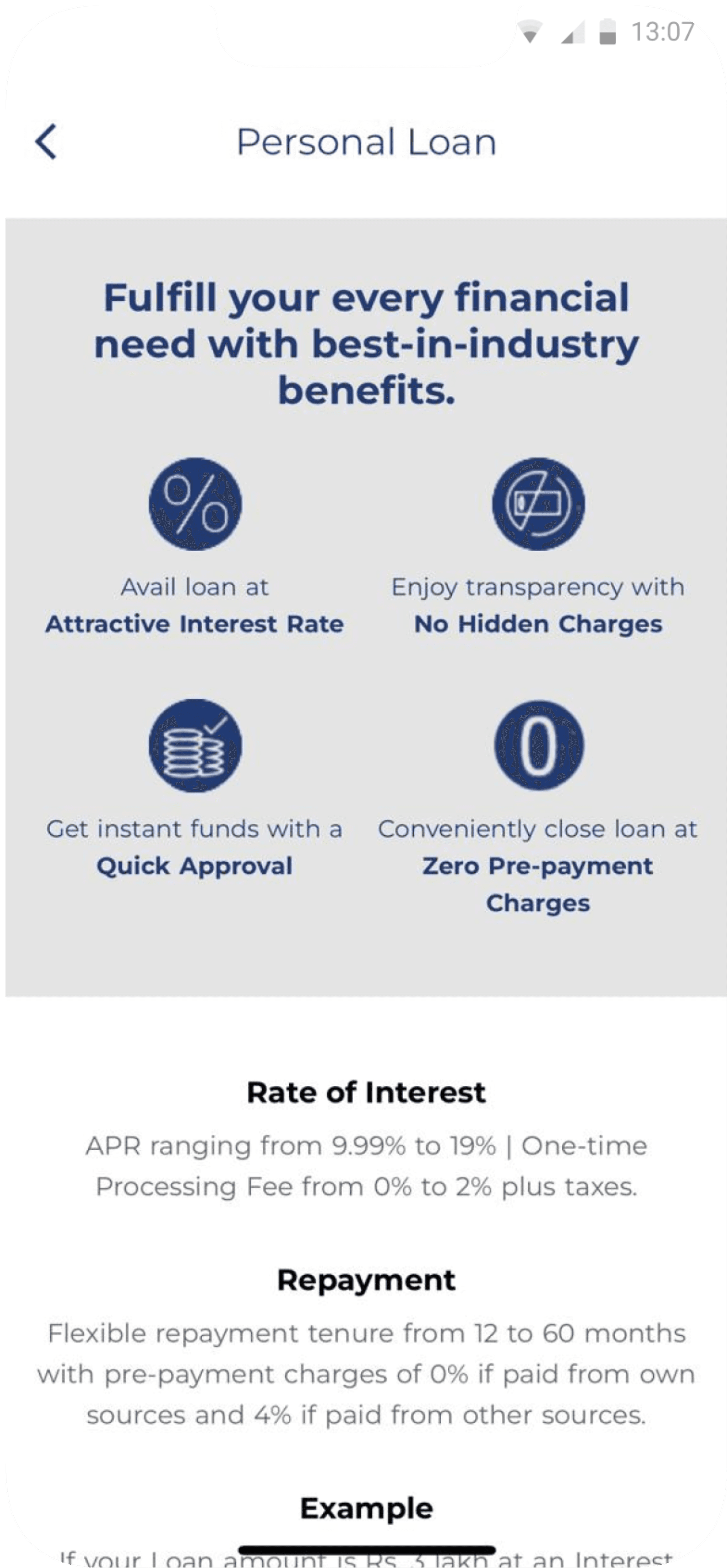
Before
After
Organized information about loan criteria into easily digestible chunks for better user comprehension
Forms
The forms were cluttered with long, unnecessary text fields and had too many steps, making them boring and cumbersome for users.

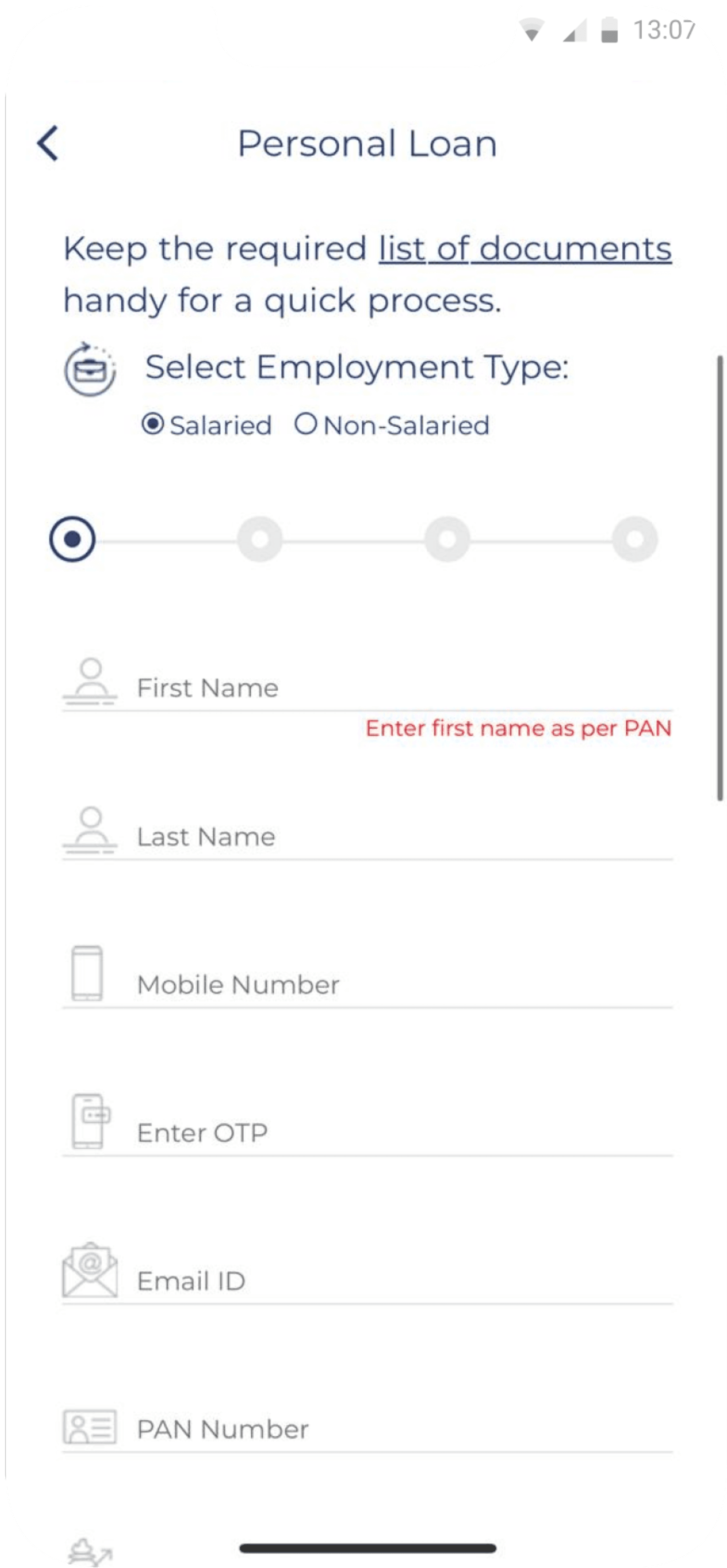
Before
After
Optimized the loan application process within a single interface, maintaining a clean and organized layout.
Bidirectional navigation allows users to effortlessly review and modify their input data.
Modernizing forms
Upgrading forms with modern aesthetics for a fresh and user-friendly approach.
Impact on user experience

The redesigned app shortens forms and journeys, boosting efficiency and delivering a faster, more seamless experience.
The app evolved from a dated, uninteresting design to a sleek, engaging interface, offering users a more appealing and intuitive experience.

It features a modern, interactive UI, transforming from a static design to a dynamic and engaging experience that enhances user interaction and personalization.
Impact on business


Reduced onboarding time by 40% with simplified steps and engaging GIFs.
Policy purchases increased by 20% due to the streamlined application process.

Improved user decision-making by 35% with clear, organized loan info, enabling faster, informed choices.
Reduced customer support calls regarding loan information by 30%.

Decreased form abandonment by 20% with a simplified, single-interface design and bidirectional navigation.
Increased retrieved policies by 30% as users could access and manage them more easily.
Learnings for next time
Voicing Key Perspectives
In this project, I learned the importance of confidently sharing and explaining ideas, even if they don’t align with existing brand guidelines. The client's outdated UI elements clashed with our modern design goals. Even with initial approval, the final product didn’t meet their expectations. This taught me to present key insights and facts from the start to ensure better alignment.
Value Collaboration
I learned how crucial collaboration is for effective presentations. To improve future outcomes, I would involve content writers, illustration artists, and other teams earlier and align them with the project vision. By tapping into their expertise well before key presentations, we could create more compelling and impactful narratives and visuals.
Document Your Process
Keeping a record of your design journey, including decisions and changes, can be really useful for the project. It helps keep everyone, including the client, on the same page and provides a clear explanation of how the design evolved. This way, you have a solid basis for discussing any future tweaks or improvements.

Let's connect to explore how can i add value to your team
"Your vision, my design – let’s create something exceptional together."
Jump to results