
Award winning
Neml
E-Samridhi
Timeline
Sept - oct
2023
My Team
UI UX team
Project manager
Content team
Tools used
Figma
Illustrator
Client
Neml e-samridhi
Service
Product Design
Overview
NeML e-Samridhi is a dashboard used by agricultural ministries, the Prime Minister's Office (PMO), traders, officials, and farmers. It tracks metrics for government schemes like the Price Support Scheme (PSS) and Price Stabilization Fund (PSF), enhancing farmer well-being. By providing insights into procurement volumes, registrations, and payouts across states, it supports decision-making and highlights top-performing regions and gaps for improved program efficiency.

Discovery
Stakeholder workshops, Website and market analysis, technical requirements.

Evaluating
Analyzing data, Defining problem statements, User persona

Ideating
Creating design concepts, making wireframes, conducting stakeholder reviews.

Design
Creating HiFi wireframes, developing style guide, finalizing design.

What We Learned Early On
From our stakeholder workshops, we knew this app needed a glow-up. Here's what we locked in:
Complex map data slowed decision-making.
Large data volumes overwhelmed the system and hindered usability.
Diverse needs of urban, suburban, and rural users were unmet.
Desktop and mobile compatibility was crucial.
A full transformation was needed, not just incremental changes.
The Problem
Transactional mindset: The dashboard was viewed only as a tool for transactions, not as an engaging platform for insights
Information sharing barriers: The old design created obstacles that slowed down information flow between users
Decision-making delays: Quick decisions became difficult due to poor data presentation and navigation
No real-time insights: Lack of current, actionable data led to missed opportunities and inefficient responses
Poor usability: The interface couldn't handle the complexity and scale of agricultural data effectively


What We Did About It
From our stakeholder workshops, we knew this app needed a glow-up. Here's what we locked in:
Old-school visuals?

Clean UI, modern colors & crisp typography
Legacy interface design
Modern design principles with intuitive layouts
Poor readability
Crisp typography for better data comprehension
Outdated color palette
Modern colors enhancing usability & professionalism
Confusing benefits?
Used icons + plain language to explain clearly
Inconsistent visual elements
Cohesive design system for engagement
User persona


Rakesh Kumar
Senior Off, Ministry of Agriculture

Gender
Male

Age
48

Location
Urban
Background
Rakesh Kumar holds a Master’s in Agricultural Science and a Diploma in Public Administration. With over 25 years in government service, he focuses on agricultural data management and policy implementation. He has basic to intermediate computer skills and is familiar with office software and government databases.
Primary goals
Accelerate Decision-Making
Enhance Data Visualization
Ensure System Scalability
Simplify Data Analysis
Needs and preferences
User-Friendly Interface: An intuitive interface that’s easy to use and boosts efficiency.
Advanced Data Filtering: Powerful filtering to quickly find and focus on relevant data, saving time.
Accessibility Across Devices: A responsive design that works across desktops and mobiles.
Pain points
Complexity of Data Interpretation: Struggles with complex map data slow down and compromise decision-making.
User Unfriendliness: Finds the dashboard interface confusing and hard to use, leading to frustration and inefficiency.
Complex Navigation: Difficulty navigating multiple dashboard layers slows access to critical information and causes frustration
Poor Mobile Experience: Finds the dashboard difficult to use on mobile.
Preferred features
Intuitive User Interface
Scalable and Responsive Design
Interactive Graph Features
Old Data Access
Wireframes


The Dashboard
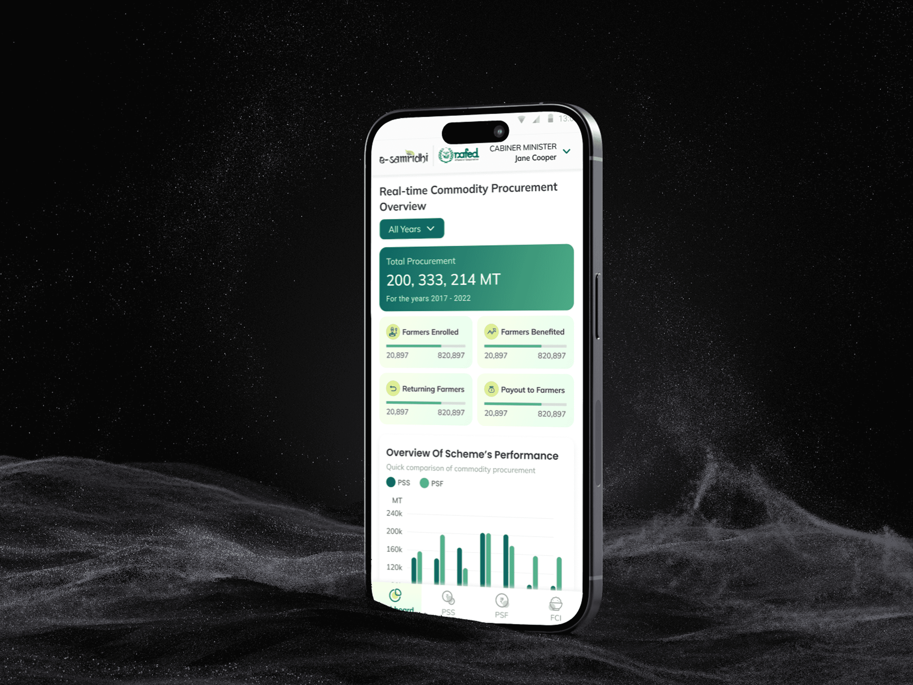
Users found onboarding difficult, so we reduced the steps and improved the design. This made onboarding quicker and easier, enhancing the overall user experience.
A separate, prominent section offers a quick overview of dashboard statistics, ensuring easy access to key data at a glance.
A streamlined graph makes comparing government schemes easy, highlighting differences and trends at a glance.
The commodities section features image cards for easy scanning, allowing quick and straightforward interpretation of items without spending much time.
Navigation is now simple and organized, with clear paths for quick, smooth access to what you need.
Colorful state maps displayed in cards, arranged alphabetically, make it easy to compare state-wise data and navigate quickly and intuitively.

Dashboard
Revamping the Scheme page
Users found onboarding difficult, so we reduced the steps and improved the design. This made onboarding quicker and easier, enhancing the overall user experience.
Breadcrumbs have been implemented to enhance user experience, providing clear system status and navigation, and making it easier to handle and explore large data sets intuitively.
The upfront years and seasons tab simplifies viewing both old and new data, making it easy to compare different time periods.

Scheme page
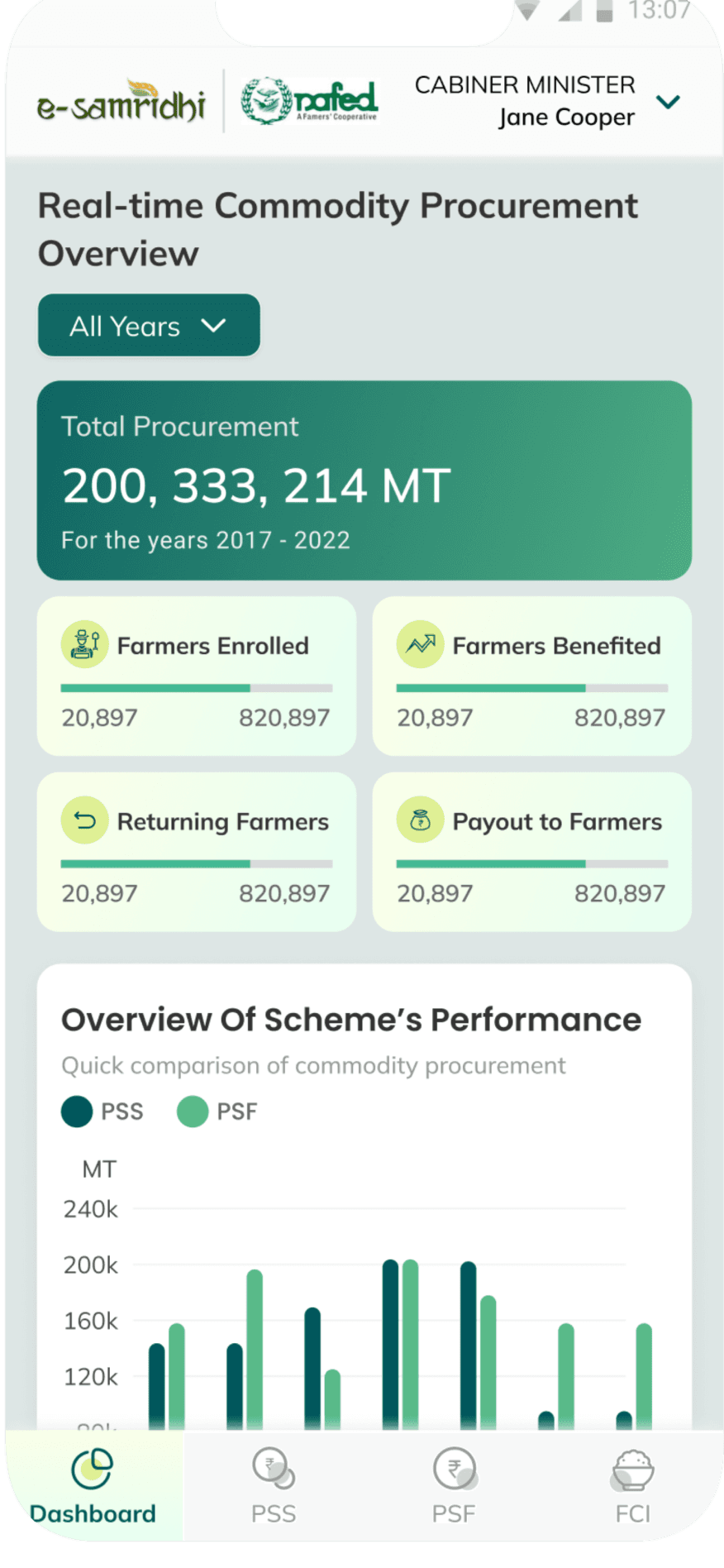
Fully responsible mobile screens






Impact on user experience

Digitally transformed the website, resulting in quick decision making.

Enhanced overall user engagement and satisfaction.

Buying and procurement have been improved to next level.

Simplified navigation meets the specific needs of the intended users.
Learnings for next time
Simplify Complex Information
How can one effectively display intricate procurement data related to state, city, and center levels, covering various government schemes, in a manner that is clear, concise, and easily digestible manner to prevent overwhelming users.
Prioritize information
Learnt how crucial is to prioritize the information to guide users for decision making process. E.g. showing procurement data of commodities, and data of how many farmers benefitted, registered and returning, and payment given farmers via schemes.
Agriculture Domain
Learnt more about agriculture industry and how government is supporting farmers in tackling price volatility of commodities.
Visual Consistency: Maintaining a consistent visual style throughout the website. Consistency in colors, typography, buttons, and other design elements enhancing the user experience.

Let's connect to explore how can i add value to your team
"Your vision, my design – let’s create something exceptional together."
Jump to results