
kOTAK gENERAL
INSURANCE
Timeline
June 2022 - Nov 2023
My Team
UI UX team
Project manager
Content team
Tools used
Figma
Illustrator
Blender
Live link
https://www.zurichkotak.com/
Client
Kotak General Insurance
Service
Product Design
Overview
Introducing a cutting-edge platform that transforms your insurance experience. This seamless solution offers coverage for motor, health, home, and travel. Users can access an extensive network of garages and healthcare providers and get real-time insights into policy volumes and claims efficiency. With clear, actionable data, the platform simplifies the insurance process, enhances transparency, and boosts customer confidence, all while improving service efficiency.


Discovery
Stakeholder workshops, Website and market analysis, technical requirements.

Evaluating
Defining problem statements, Analyzing data, Competitive analysis, User persona

Ideating
Creating design concepts, making wireframes, conducting stakeholder reviews.

Design
Creating HiFi wireframes, developing style guide, finalizing design.

What We Learned Early On
From our stakeholder workshops, we knew this app needed a glow-up. Here's what we locked in:
Underwent in-depth insurance industry training to understand policies, coverage options, and user expectations.
Stakeholder workshops highlighted the need for trust-building design, clear information grouping, and user-friendly journeys.
Recognized the importance of fast, reliable site performance and personalized features for returning users.
The Problem
The website was confusing, with complex navigation and unclear organization.
Many users abandoned the insurance buying process due to friction and distrust.
Special offers and important information were not effectively highlighted.


What We Did About It
From our stakeholder workshops, we knew this app needed a glow-up. Here's what we locked in:
Challenging journey?

Simplified the process with a sleek, modern interface.
Complex forms?
Streamlined, intuitive user flows.
Hard-to-find offers?
Subtle prompts featuring special pricing and promotions.
Trust issues?
Design focused on reliability, credibility, and transparency.
Cluttered information?
Logical grouping and clear hierarchy.
Returning users’ needs?
Personalized, seamless journeys.

Kotak General Insurance

Go Digit

Acko
Visual Design & Trustworthiness
Visual Hierarchy & Clarity
Personalized User Journeys
Data Collection & Form Simplicity
Interactive Tools (Calculators, Quotes)
Responsive Design
Micro-interactions & Feedback
Consistency & Design Language
Visual Cues & Information Highlights
Visual Cues & Information Highlights

Too corporate, lacks warmth and modernity.
Cluttered, lacks clear information flow
Generic flows, limited customization
Lengthy forms, overwhelming data input
Limited tools, lack of transparency in pricing

Responsive but lacks fluidity across devices
Limited feedback, static interactions
Inconsistent across sections and services
Limited accessibility features
Missing clear visual cues for key info
Modern, minimalistic, and user-friendly
Organized layout with intuitive info display
User preferences drive customized experiences
Easy data entry with clear progress indicators
Simple, transparent calculators and quotes
Seamless cross-device experience
Smooth interactions with instant feedback
Uniform branding and design throughout
Inclusive design for a wider audience
Clear visual cues to emphasize key details
Clean, friendly, and engaging design
Effective use of icons and infographics
Personalized journeys based on user profiles
Minimalist forms with clear progress tracking
Clear, intuitive tools for pricing and quotes
Fully responsive with optimized layouts
Guiding micro-interactions
Strong, cohesive design language
Designed with accessibility in mind
Effective use of icons, highlights, and color etc.
Competitive analysis
User persona


Neha Verma
Marketing manager

Gender
Female

Age
29

Location
Urban
Background
Neha Verma, a 29-year-old HR specialist, juggles a busy career and personal finances, including car insurance. Tech-savvy yet practical, she seeks a straightforward, efficient way to manage her car insurance, balancing cost and coverage effectively.
Primary goals
Clarity: Ensure all information is clear and easy to understand for swift decision-making.
Streamlined Processes: Simplify complex tasks to reduce stress and enhance productivity.
Convenience: Seamlessly access and manage tasks on mobile devices anywhere.
Needs and preferences
Trust and Security: Needs a platform that feels secure, especially when handling financial transactions.
Support: Wants easily accessible customer support for any issues or questions that arise.
Pain points
Security Concerns: Worries about the security of personal and financial information if the platform does not appear trustworthy.
Information Overload: Overwhelmed by excessive details or complex jargon that makes it hard to understand policies and options.
Slow Performance: Frustrated by slow loading times or unresponsive features, especially on mobile devices.
User environment
Mobile: Home, office, travelling
Laptop: Home office
Quote
“Efficiency and clarity are key for me. I need an easy way to manage my car insurance that saves time and gives me good value.”
Wireframes


Home Page
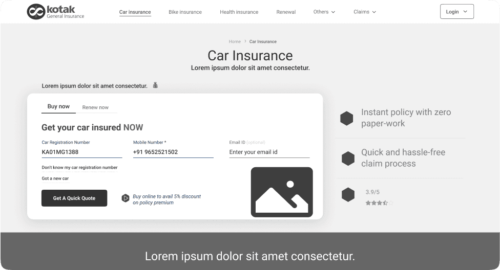
Users were frustrated by a cluttered layout and poor design, so we simplified the UI, removed unnecessary information, and added a lead-generating form. This made the site more functional and user-friendly, improving the overall experience.
There's no lead-generating form, which may result in missed opportunities to capture potential customer information.
Unwanted information with each insurance type is taking up valuable space,
The overall UI is poorly designed, affecting functionality and user experience negatively.
The navigation bar is taking up unnecessary space, affecting the overall layout and usability.
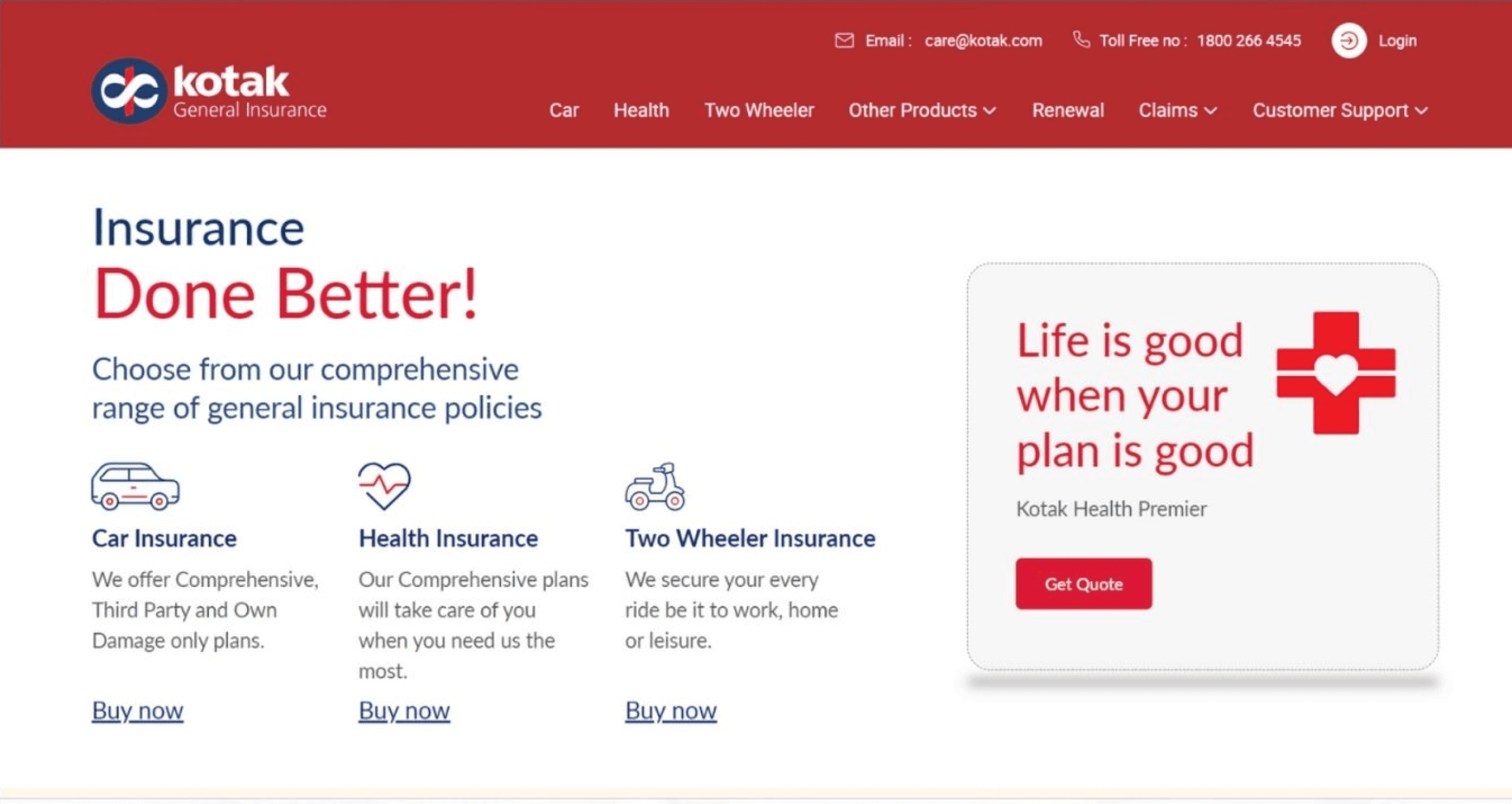
Re-engineered the navigation structure to be more intuitive, making it easier to access key information and business offerings with fewer clicks.
A lead-generating form has been added, featuring easy selection of insurance types with intuitive icons for a smoother user experience.
Created an engaging and intuitive user experience across various touchpoints, enhancing interaction and satisfaction throughout the journey.
The Product Page
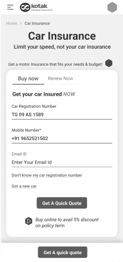
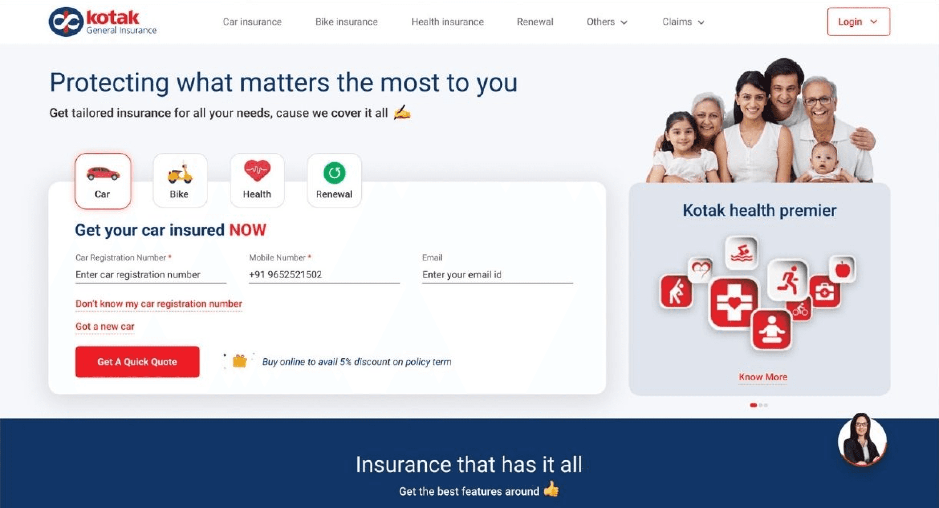
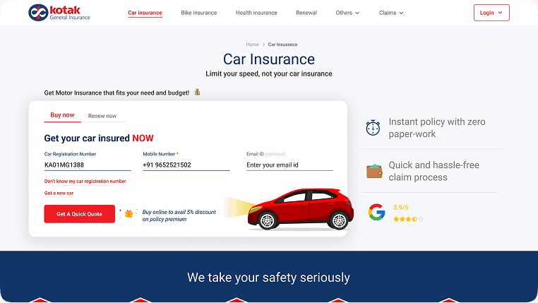
Users were frustrated by a cluttered layout and poor design, so we simplified the UI, removed unnecessary information, and added a lead-generating form. This made the site more functional and user-friendly, improving the overall experience.
The insurance buying journey is too long, overwhelmed with unnecessary steps and data, making the process tedious and frustrating for users.
There’s a missed opportunity to highlight discounts and quick features on the page, which could attract and engage users more effectively.
The navigation feels disconnected from the homepage, leading to a disjointed user experience.
1
2
3
4
5
6
7
8
Details
Car details
Policy details
Quote selection
Add ons selection
Proposal
summary
Payment

The insurance buying journey has been streamlined, reducing the process to just 5 essential steps, eliminating unnecessary data, and making the experience quicker and more user-friendly.
Space has been optimized effectively, showcasing discounts and key features alongside a details form
Created an engaging and intuitive user experience across various touchpoints, enhancing interaction and satisfaction throughout the journey.
1
2
3
4
5
Details
Quote & add ons
Proposal
summary
Payment
The Quote Page
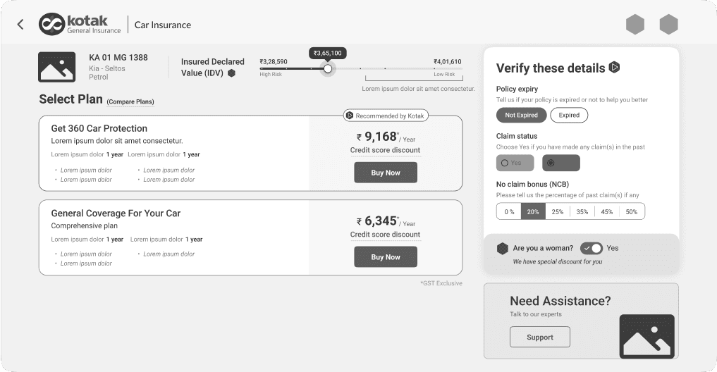
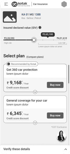
Users found the page cluttered and overwhelming, so we streamlined it to fit within a single scroll, focusing on essential content and adding personalized elements and nudges for a more efficient, user-friendly experience.
The page is cluttered with unnecessary information, which slows down decision-making and overwhelms users.
The information requires more than one scroll to view, potentially leading to missed content and a less efficient user experience.
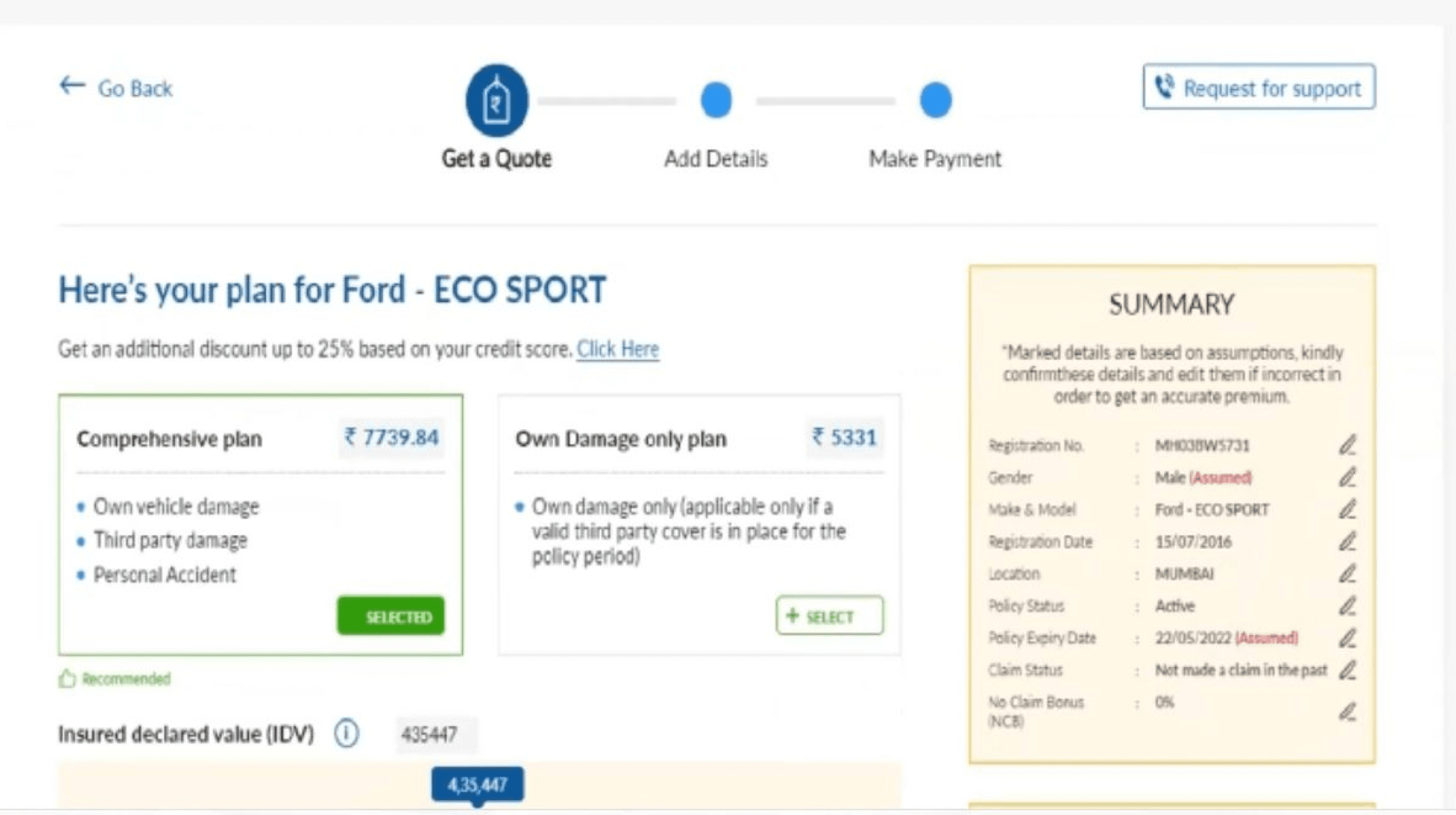
Only necessary information is shown, along with an image of the customer's car, to align the system with real-world.
All information is organized with a hierarchy of importance and presented in an easy-to-interact format, fitting within a single scroll.
The page is personalized and customized, with nudges provided to guide and prompt users effectively.

The Proposal
Users struggled with a poorly designed page, complicated by disorganized forms and multi-page steps. We revamped the experience with conversational content, auto-fetched details to reduce text fields, and used accordions to present information in a single, navigable page.
The overall page is poorly designed, featuring non-user-friendly content that hinders effective use
Breaking the steps into three separate pages increased the mental load and complicated the user experience.
The forms were disorganized and had a confusing layout, making them difficult and frustrating to fill out.

Enhanced the journey by incorporating conversational content, making the experience more engaging.
By enabling maximum details to be auto-fetched, the mental load on users is reduced, and the number of text fields is minimized.
Pages are presented as accordions on the same page, making it easier to understand and navigate to the next step.

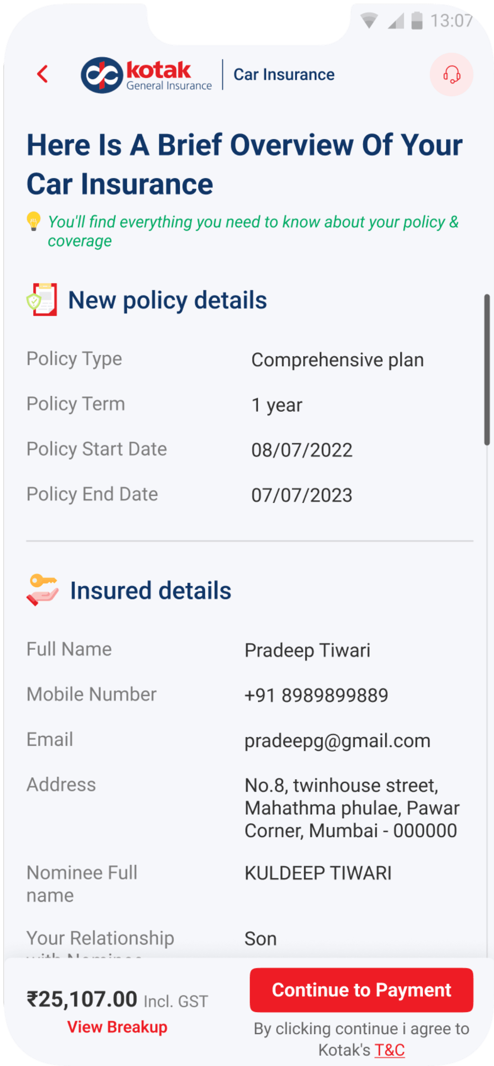
Fully responsible mobile screens





Impact on user experience

Revamped the website's visuals to blend professionalism with a welcoming touch, building trust and making users feel comfortable.

Simplified the data collection process by reducing form fields and steps, and added a progress tracker to keep users informed and engaged throughout the journey.

Created a clear visual hierarchy to showcase pricing tiers and coverage benefits, using icons, infographics, and concise text for easy understanding of complex information.

Established a consistent design language throughout the entire website, reinforcing a cohesive brand identity and creating a seamless, unified user experience across all pages and touchpoints.

Introduced personalized journeys that adjust to each user’s profile and preferences, leading them to insurance options tailored to their specific needs.
Added visual cues like icons, prompts, and color highlights to emphasize key information, helping users quickly spot benefits relevant to their needs.
Impact on business
Enhanced user engagement

Increased lead capture by 20% within the first month after adding a lead-generating form on the homepage.
Reduced customer support calls related to navigation issues by 35% after improving mobile responsiveness and cutting page load times.

Fewer customer support queries
Achieved a 50% reduction in page load times, enhancing overall user experience and performance, especially on mobile devices.
The streamlined purchase process and personalized journeys led to a 30% increase in the number of policies bought.

Page optimization
Enhanced mobile responsiveness contributed to a smoother experience, resulting in a 25% increase in engagement from mobile users.
The improved user journey and usability increased the number of retrieved policies by 25%.

Learnings for next time
There is more than one solution to a problem
I learned that there isn’t just one way to solve a design problem. Trying different approaches showed me that each has its own pros and cons. It made me realize how important it is to explore options to find the best solution.
Emphasize Micro-Interactions
Small, thoughtful animations and feedback can greatly enhance the user experience by making interactions feel more intuitive and satisfying.
Advocate for the User
Even when faced with business constraints, always keep the user’s needs at the forefront. Being an advocate for the user ensures that the final product serves its intended audience effectively.

Let's connect to explore how can i add value to your team
"Your vision, my design – let’s create something exceptional together."
Jump to results